Organizing real-time data and communicating critical information in a parent-friendly interface
Los Angeles School District is the second largest school district in the nation, with thousands of parents and an array of information.
☺%
Improved and streamline the overall parent-user experience.
↓%
Reduced needless office visits just to enter data by by working parents.
↑%
Increase parent participation in student life, school activities and after school programs.
My Role
UI Design
Visual Design
UX Design
Project Scope
1 UI Designer, 1 UX Researcher, 1 IA Designer, 1 Designer Manager
Timeline
7 months, Agile
Deliverables
High fidelity designs, Design System, Iconography
Tools
Sketch, Google Material, After Effects
Overview
Los Angeles School District is the second largest school district in the nation, with thousands of parents and an array of information. Qualitatively, LAUSD aimed to improve and streamline the overall parent-user experience and needless office visits by creating a one-stop shop app. In result improving the communication between the schools and parents and creating a closer community of thousands of parents. Quantitatively, the app launch succeeded in reducing the cost of creating due to using Google Material design. An increase of parent participation in student life, school activities and after school programs.
Background
The core objective was to unify and streamline the district’s online presence, improving search and find-ability for parent resources and programs. Challenges included organizing real-time data and communicating critical information in a parent-friendly interface. Through parent impression testing and iterative design we created a cohesive app for parents to access.

Primary Research: Competitive Analysis
We researched other school-parents communication apps, including Blackboard, ClassDojo, and Google Classroom. However, since these apps require an existing parent or student account to access, it was challenging to fully experience them.
To overcome this, we searched online and watched tutorial videos on YouTube to gather as much information as possible.
I analyzed the common patterns, color schemes and components to understand the rationale behind their design choices.
Our findings revealed that most of these apps use bright colors and simple card layouts to create an intuitive and engaging experience for both parents and children.

Branding Research
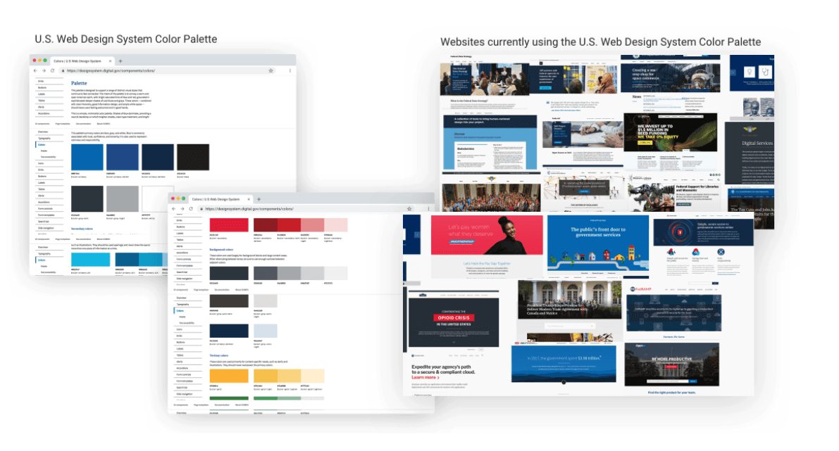
At the time, LAUSD didn't have an established branding color scheme, so they were open to us creating one. Given that we were working on a government app, I explored the U.S. Web Design System color palettes and reviewed websites utilizing that design system. This helped me establish guidelines and begin conceptualizing color schemes and iconography.
Testing with Parents: Color Scheme
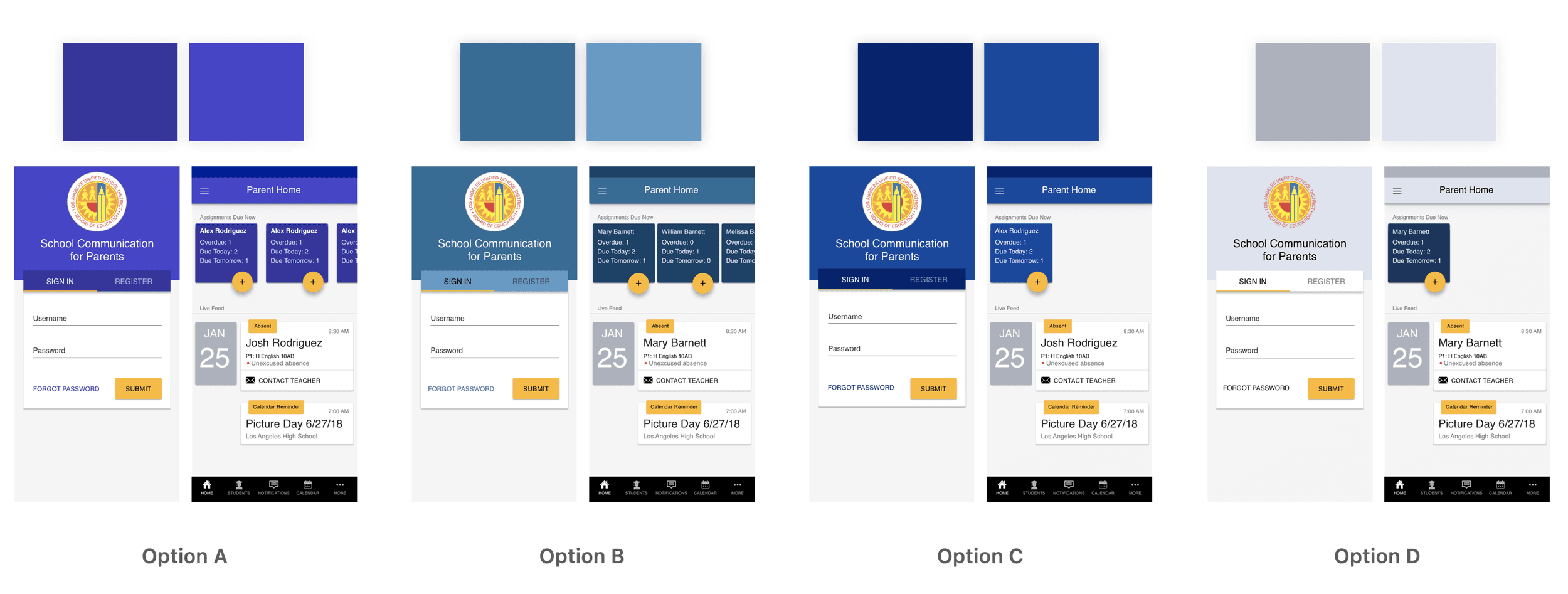
After developing a few design concepts, we conducted parent impression testing to evaluate design styles, patterns, and color schemes. The testing covered various areas, including the login page, onboarding preferences, parent dashboard, student landing page, and student profile. Drawing from my research on U.S. government websites, I created five color scheme options using Google’s Material Design color tool. The results showed that parents gravitated toward the navy blue schemes, particularly option C, noting that the color made them feel "calmer" and "more academic.”
Design Exploration: Testing Styles with Parents
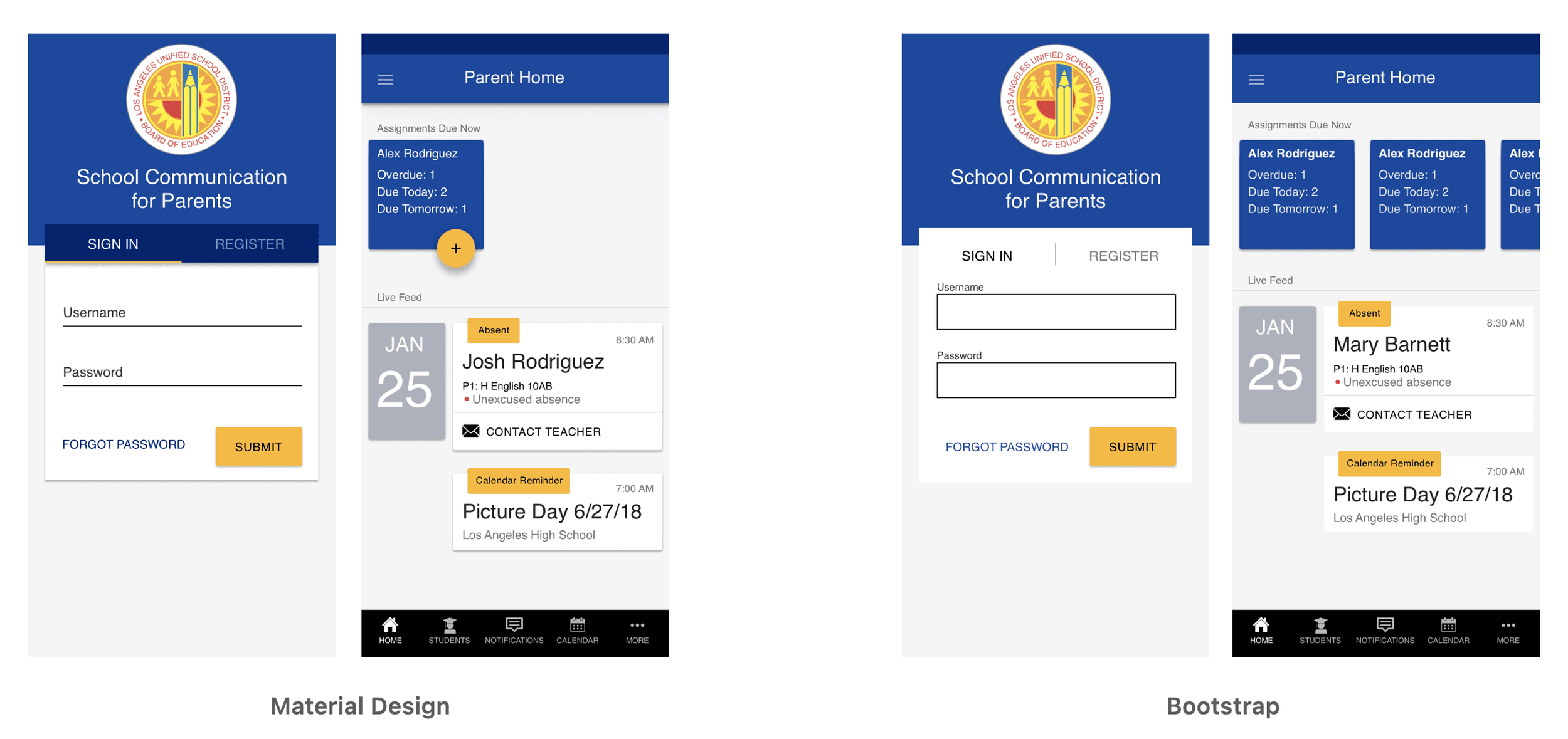
We tested Material Design against Bootstrap for the design style. These frameworks were chosen to save time and avoid the need to develop a custom visual language, especially under tight deadlines. Google's Material Design, in particular, has an established reputation for trust and security, making it an obvious choice to test with parents, who were likely familiar with its style.
The results showed a strong preference for Material Design:
Parents found it easier to scan the information
The interface felt cleaner
They recognized familiar components like floating buttons and text fields
Testing with Parents: Iconography
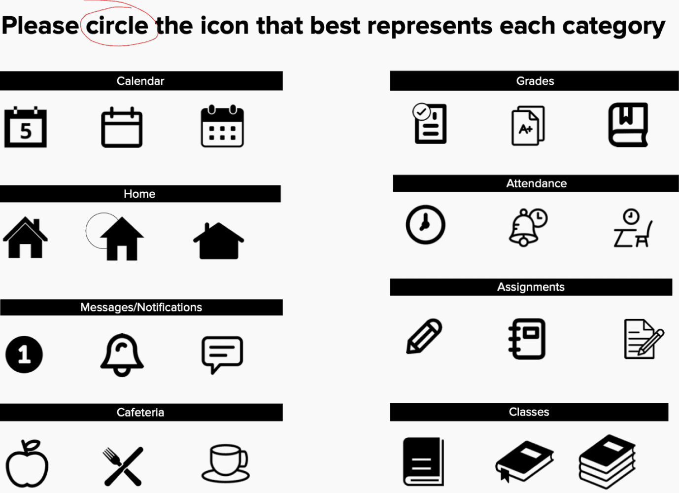
We conducted tests on various icons representing categories like "Home," "Classes," and "Attendance" to determine which resonated most with parents. The results showed a clear preference for filled icons, as parents found them to be:
Easier to see
Clearer in meaning
Simpler, with fewer complex design elements

Ideation
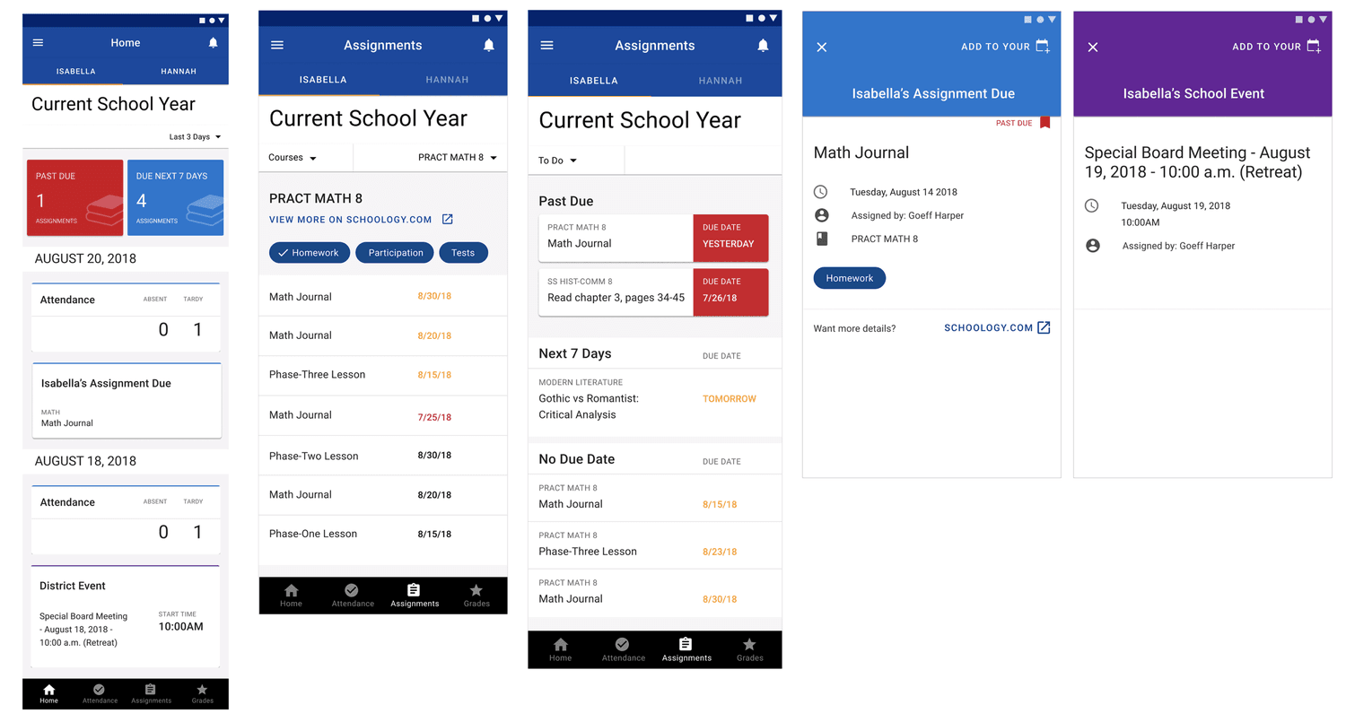
We had a couple of design iterations for components within the app. We needed to create a couple of components to interchange information for the following items:
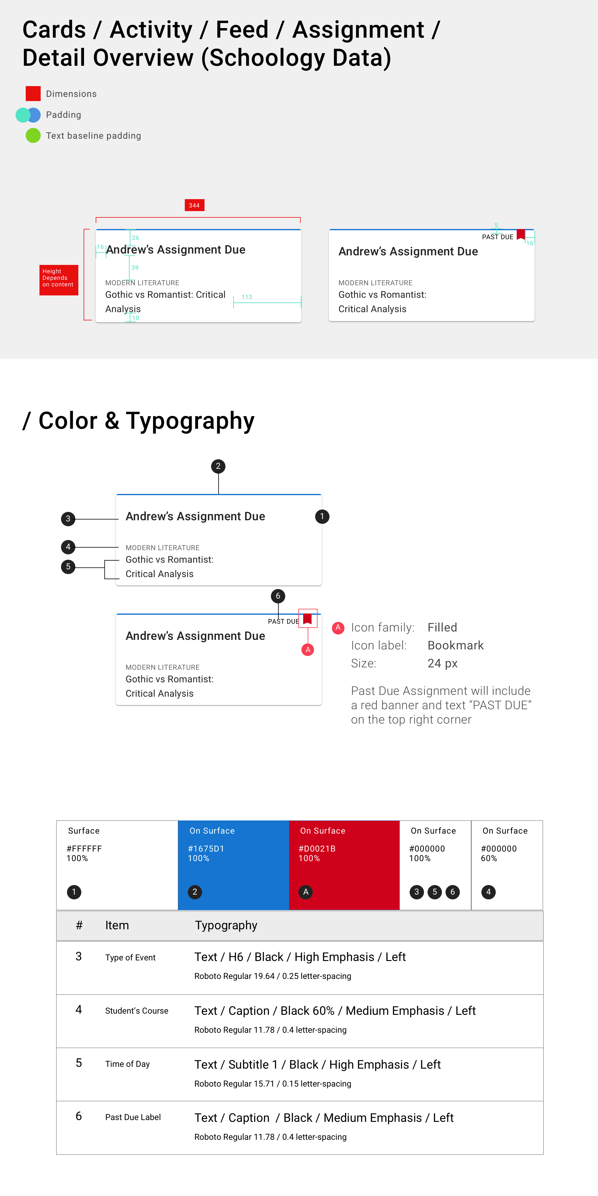
Represent assignments and their status
Attendances
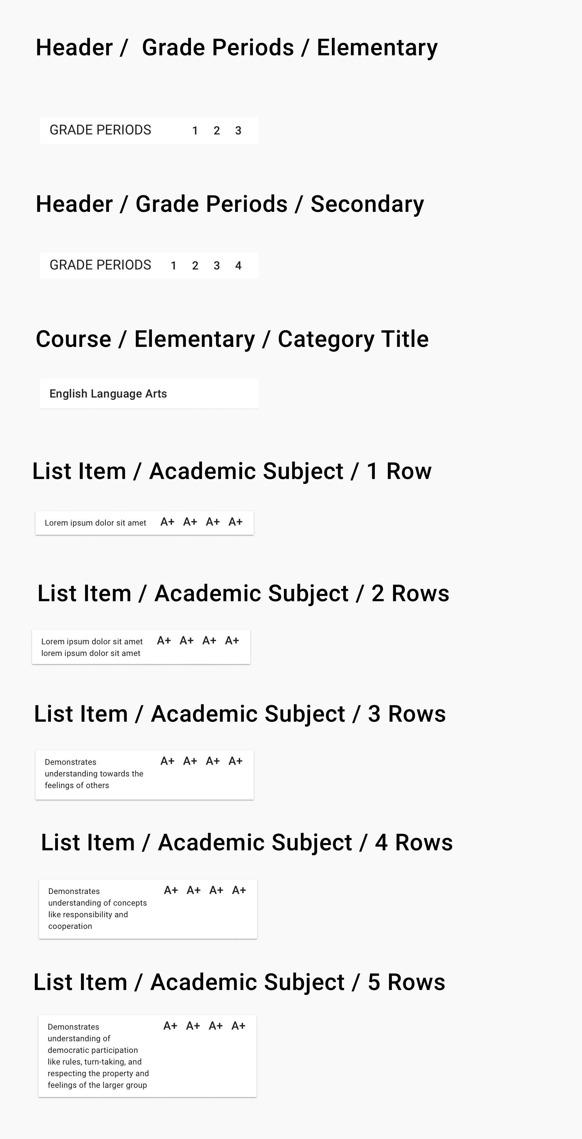
Grades


Design System
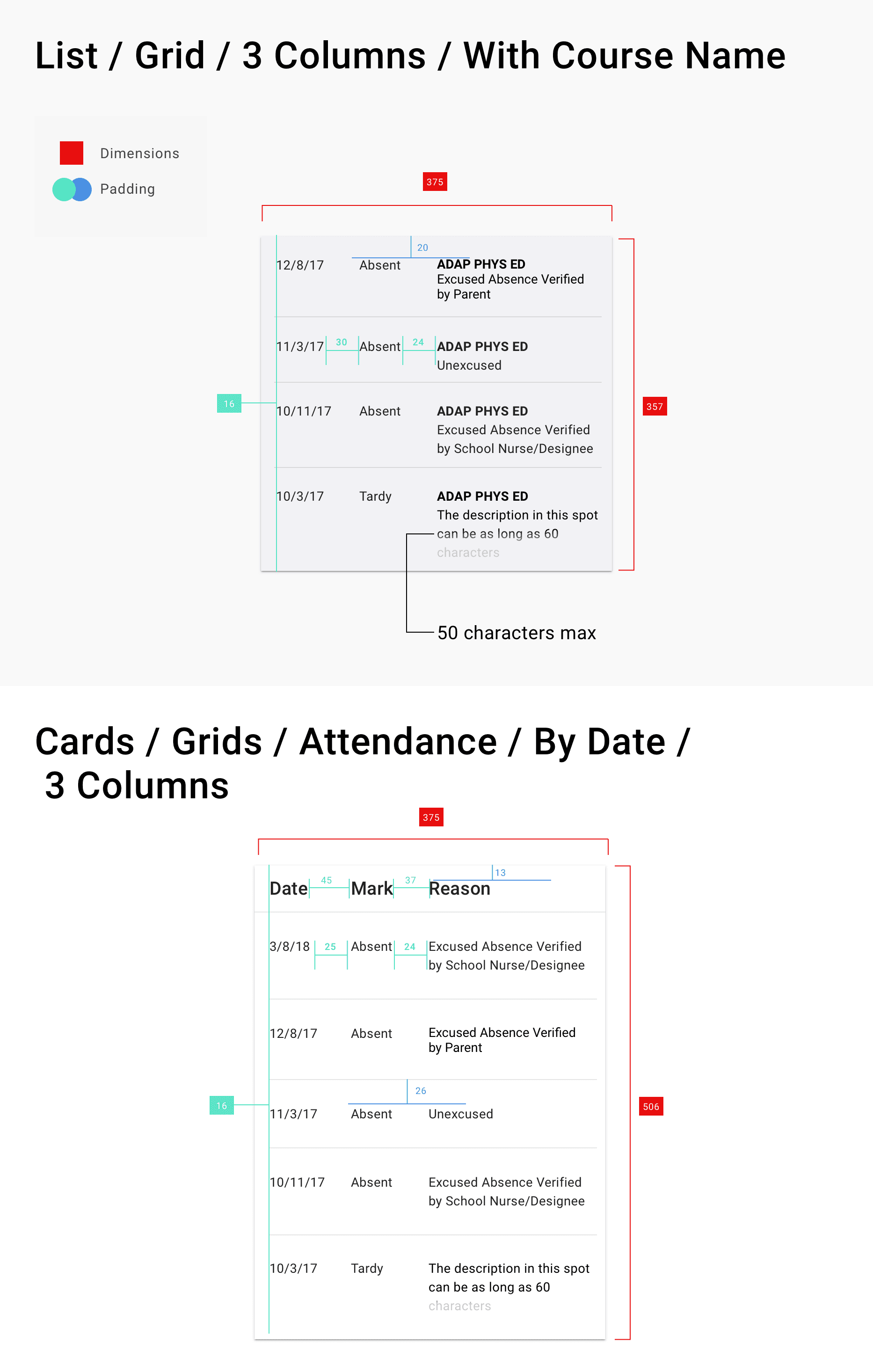
We worked with google material design which already had a clean state design system for us. All I needed to do was change the color scheme and re arrange some of the new components around into our desinated system.
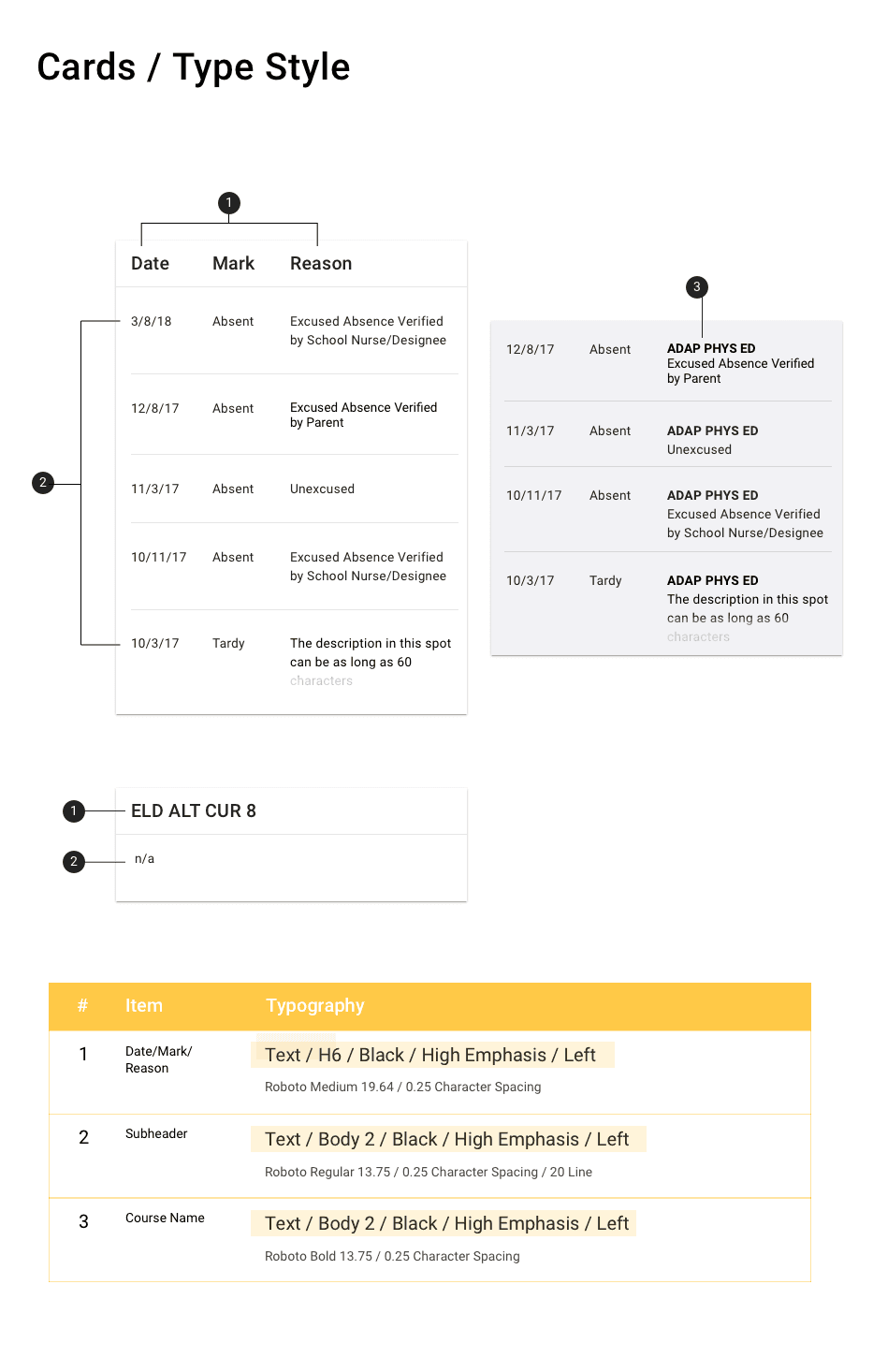
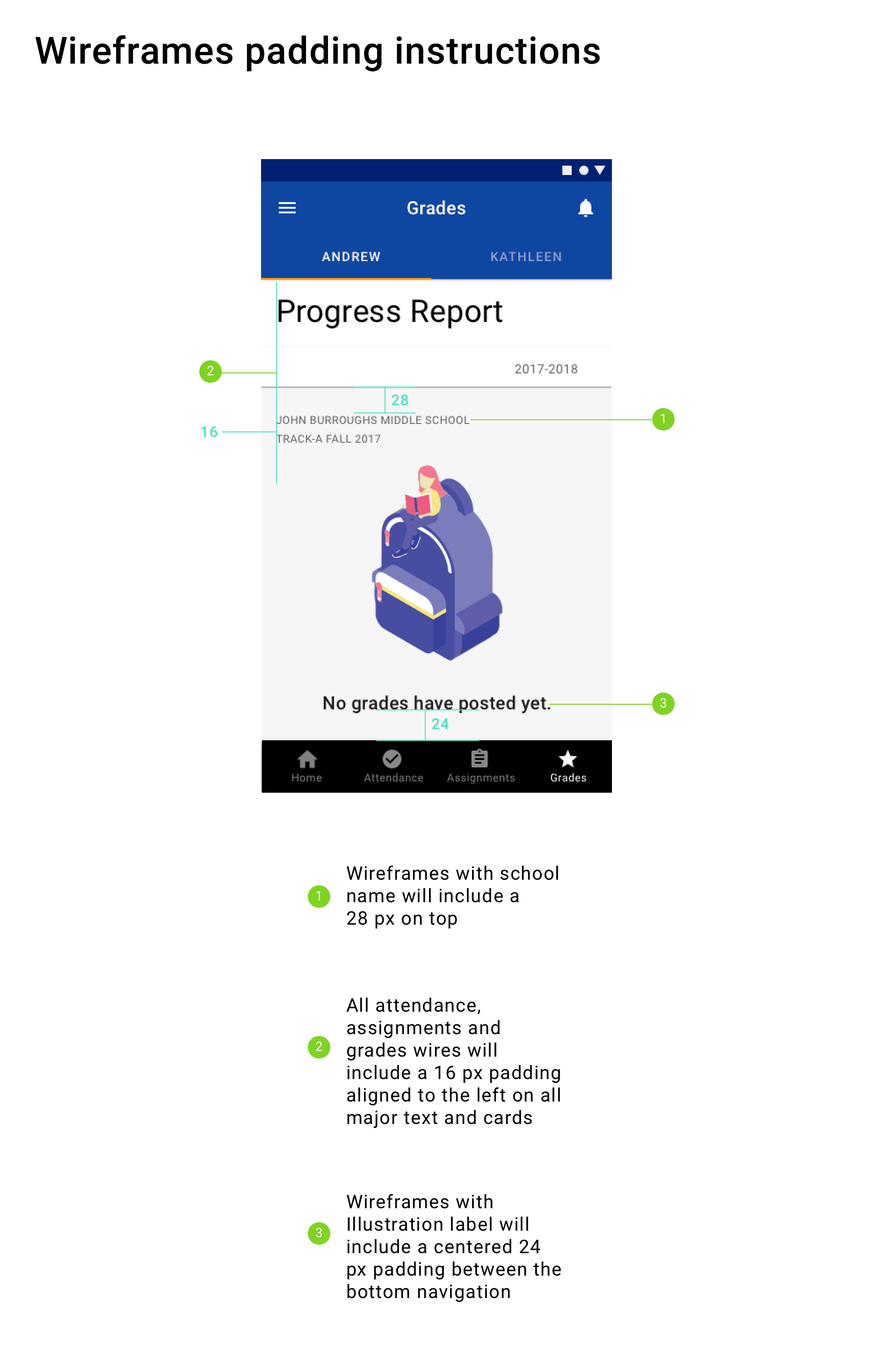
However, there where new components created that need extra annotations created for, these included Course list, Attendance list, Grade Periods and Cards.
Reflections
I quick time spent with my time was challenging but fufillful! Proud of what me and the team worked on and how we made a change for millions of parents in the district. As the UI designer one of the main things I would have done differently was utilize tools such a Zeplin to help my designs become inspected easier for the developer.
