Web Design, Prototyping, Animation - 2025
Yassifying the largest queer streaming platform.
My Role
UI Design
Visual Design
UX Design
Duration
1 Month
Tools
Figma, Protopie, Adobe Photoshop
Overview.
WOW Present Plus, faced usability challenges that affected user engagement and retention. Common user complaints included navigation difficulties, outdated UI aesthetics and limited personalization features. The design objective was to enhance the platforms' usability while maintaining the fun, vibrant brand identity. Let's yassaficate this platform!
Motivation
For this project, I decided to redesign the web browser. I felt like this was the most used platform for myself and friends, as well as there was a need of a UX/UI overhaul. I found that the streaming platform has significant UX flaws and utilizes outdated design patterns. So, I dug further into these issues, I decided to conduct competitive analysis.
Discover
There's a lot of streaming platforms I could have selected, but I've decided to go towards two larger well known platforms and 1 specific genre-focused.
Hulu
Netflix
Shudder
World of Wonder

Site Map
I decided to create a site map and analyzed what internal and external pages where happening. To my surprise there were a lot of pages I was not aware of as a frequent user of the streaming platform. Some of these pages seemed outdated while others where interesting such as the merch store.
If I was hired to redo do their navigation I would prioritize which categories we would want to list out. Conduct card storing, page visits and user testing. Depending on how much revenue or goal is being made based off their merchandise store.
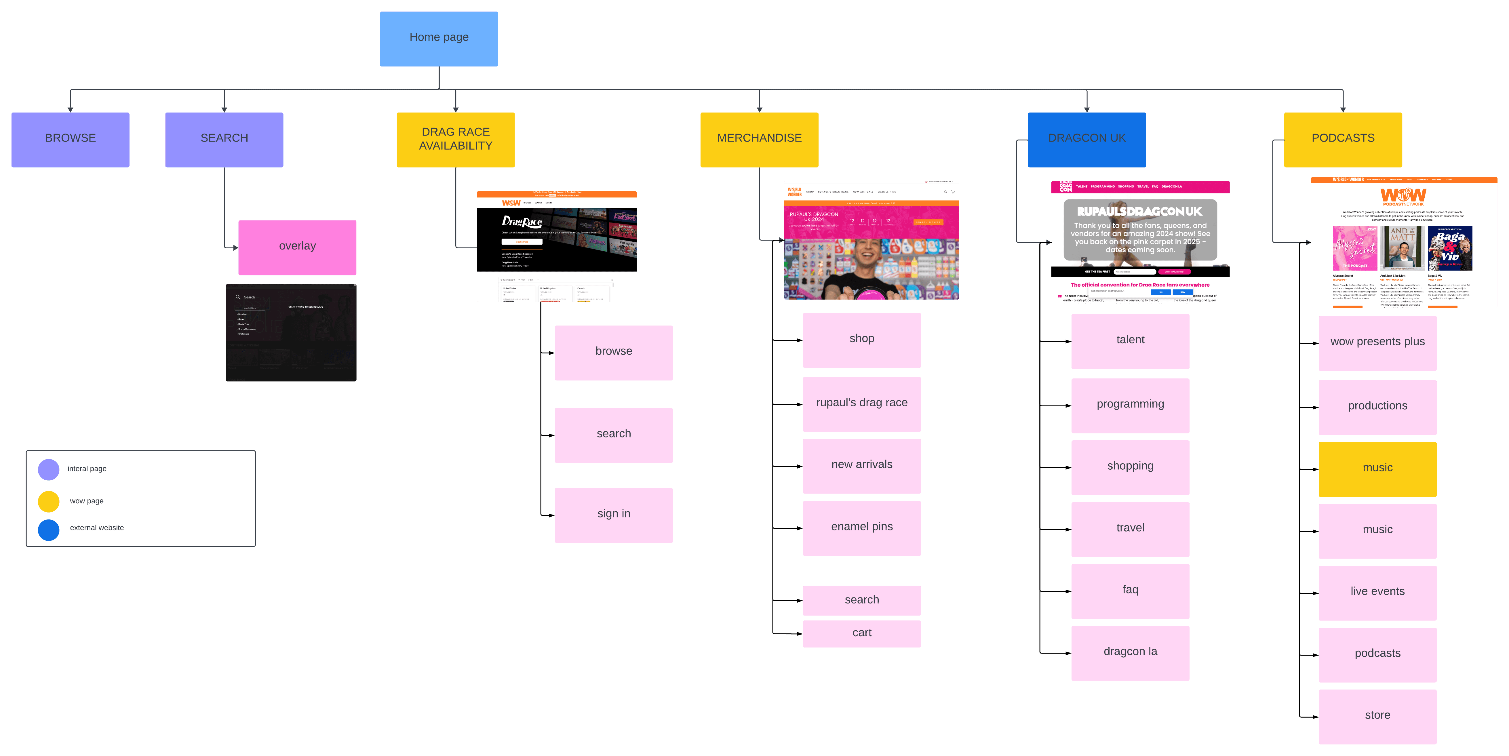
Personas
I created a mini-hoc persona based off users of WoW and drag race fans.
Design
Ok, now we start to get into designing the components. I like to brake down each blade and create various iterations this allows me to focus more on each component and bring each one into different use cases.
Category: Navigation
Original:
Wow's navigation is underperforming for a user.
Category: Show Banners
WoW has great visual banners! I enjoy how colorful, fun and original the logos are for each show. However, I do believe it can be overwhelming to look at especially if these banners contain important info such as release dates, descriptions and hosts. It also lacks the importance of a CTA button to redirect the user to learning more about the show.


Re-designed
I wanted to keep the elements of fun and colorful. Adding a more common template by structuring out the name of the show / description / CTA play button. Adding the modern take on adding a trailer video on one specific banner when first landing on the website.
Category: Show Content
The continue watching section isn't bad, but there can be room for improvement. The thumbnails are showing previews, title of the episode, length of the ep/show and progress bar.
Re-designed
I've kept the preview image of the show, it gives a nice quick overview of the what part of the episode you left on. Kept the importance of the episode title and added the show's title. When you hover over the thumbnail it will….
Category: Catered section for you
I wanted to give a twist on the 'We think you might like' section for this. Grabbing inspiration from Spotify playlists, I created a blade where it stands out for the user to be introduced to WoW originals or other series they might not have known about.
Category: Marketing
Now, we understand how important marketing a specific show or ad is for any network is. Originally there was little to no promotions on their website. They are however great at advertising on their youtube channel and instagram.
I recommend adding the flare of promoting content and stylizing it to fit within the page. One of the biggest items I've decided to highlight in the re-design is DragCon. I've created a think pink ad banner with a countdown. This is intended for the consumer to click on the banner to led them to the ticket page to learn more and purchase tickets.
Impact & Takeaways
Now, we understand how important marketing a specific show or ad is for any network is. Originally there was little to no promotions on their website. They are however great at advertising on their youtube channel and instagram.
I recommend adding the flare of promoting content and stylizing it to fit within the page. One of the biggest items I've decided to highlight in the re-design is DragCon. I've created a think pink ad banner with a countdown. This is intended for the consumer to click on the banner to led them to the ticket page to learn more and purchase tickets.